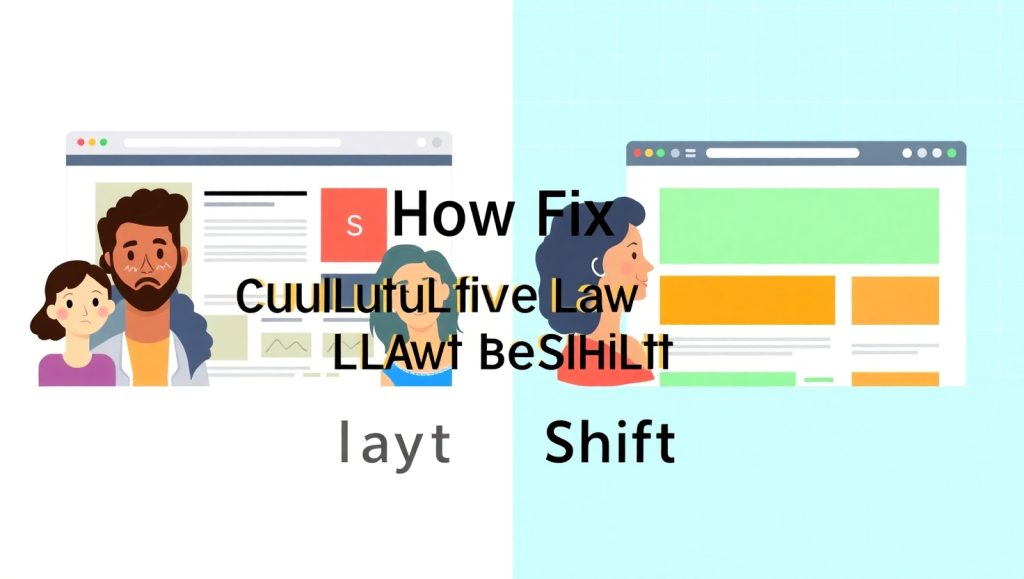
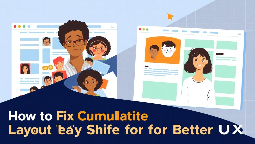
What Is Cumulative Layout Shift (CLS) and Why It Matters
CLS, an acronym that stands for “Cumulative Layout Shift,” is one of the perhaps-few metrics that worry Google in the Core Web Vitals ranking paradigm-a ranking system meant to measure real-life user experience on websites. To be specific, CLS measures the total amount of visible content on a web page that gets displaced as loading progresses. For example, you might be reading an article and then suddenly an advertisement loads and pushes your content out of your view. That jerk in movement? That’s the CLS happening in real terms.
Why should we care about this? Because the unwanted movement annoys users. Poor CLS counts translated into an unstable webpage for the visitor, and this instability not only causes a poor experience but further compromises the SEO rankings. CLS could lead to some misclicks, which might eventually reduce conversion rates, increasing bounce rates. For instance, a shift of a “Buy Now” button as someone is tapping it could lose a sale-or worse, unnecessarily trigger a refund.
With the continuing mobile supremacy in 2025, this layout stability has never been more pertinent. Mobile screens are smaller, with slower networks, thus making any unexpected movement far more evident. Google, therefore, recommends that for a good experience with web pages, the CLS score should be below 0.1; users today expect sites to behave as stable as a native application.
But fear not! CLS trouble is easy to fix. You won’t need to rebuild the entire site: you just have to know what causes the shifts and how to stop them. So let’s look at the ways to do this step-by-step.
Use Performance Tools Like PageSpeed Insights
PageSpeed Insights is a great place to start. Just enter your URL, and it gives a full detailed breakdown of the performance metrics, including CLS. If your score is above 0.1, you will see visual cues as well as a list of elements contributing to the shift. Fast, easy, and beginner-friendly. Another tool is Google Search Console. Its Core Web Vitals Report shows you real-life data from actual users, indicating whether layout shifts have occurred on mobile, desktop, or both.
Record a Lighthouse Report or Use Chrome DevTools
For a more rigorous diagnosis, you can use the Chrome built-in Lighthouse tool or the Performance tab under Developer Tools; these provide a facility to replay the load of the website frame-by-frame. You will see exactly when layout shifts happen and which DOM elements are held responsible.
Remember tools like WebPageTest.org and GTmetrix that provide a visual loading timeline; these third-party options are more useful when diagnosing a more complex page, such as an ecommerce checkout or a media-saturated blog post.
Common Causes of Layout Shifts and How to Fix Them
Missing Dimensions on Images and Videos
One of the most frequent culprits is media content without height and width attributes. When an image loads, if the browser doesn’t know its dimensions in advance, it just reserves a generic space. When the image finishes loading, it pushes other content around to make room.
The fix? Always set width and height attributes on <img> and <video> elements. Better yet, use modern responsive formats like aspect-ratio in CSS to maintain layout fluidity.
Example:
<img src=”hero.jpg” width=”800″ height=”400″ alt=”Hero banner”>
Or via CSS:
.hero {
aspect-ratio: 2 / 1;
width: 100%;
}
CSS Strategies to Maintain Layout Stability
Beyond fixing specific elements, you can adopt broader CSS techniques that promote layout stability.
Use CSS Grid and Flexbox Wisely
Modern layout systems like Grid and Flexbox are incredibly powerful—but also tricky. If not managed carefully, they can cause layout jumps, especially when content size changes dynamically.
Tips to avoid this:
- Avoid min-content or auto values that can change unexpectedly.
- Set max heights and widths where appropriate.
- Combine flex-shrink: 0 and overflow: hidden for items that shouldn’t collapse.
Keep layout containers predictable. The more defined the structure, the fewer surprises during load.
Avoid Font Swaps Without Fallbacks
Fonts, another insidious source of CLS. When a browser loads fonts Web, it will, for a moment, show the user a fallback font and swap it in when the custom font is done loading. This change of font will often force a reflow.
The remedy is to implement font-display: swap in your CSS; additionally, preload fonts so that they load more quickly. Also, a library to postpone the display of text until it is fully loaded is FontFaceObserver.
Example:
@font-face {
font-family: ‘MyFont’;
src: url(‘myfont.woff2’) format(‘woff2’);
font-display: swap;
}
This strategy reduces “flash of invisible text” (FOIT) and stabilizes the layout.
Testing and Optimizing Across Devices
Once you’ve implemented fixes, it’s time to test again—but not just on desktop. Device variability matters a lot in 2025.
Simulate Mobile Conditions
DevTools Chrome enables you to emulate various famous ones such as iPhone, Galaxy, etc. And again today, introduce yourself to an even slower network and CPU throttling to get into the real-life conditions of a mobile device. It jagged more CLS issues because slowness in speed hinders render.
Monitor With Real User Metrics (RUM)
Real User Monitoring tools such as New Relic, Datadog, or Google’s Web Vitals JS empower you to collect performance data from real visitors to your sites. This helps you track whether any CLS issues are persistent under different situations like slow connections, different browsers, or screen sizes.
Consistency across different devices instills user trust, especially in ecommerce or SaaS platforms, where user friction means lost revenue.
Conclusion
Although it may sound like a very technical metric Cumulative Layout Shift affects something which is completely human: how at ease and confident someone feels using your Responsive website . In short, identify the causes, properly set dimensions, refine layouts with CSS, and test on the devices in order to reduce friction and make clearer site experience. Your users remain focused, your bounce rates go down, and your conversion rates increase.
In addition, search engines reward stable and user-friendly sites with their rankings. Taking care of the CLS is not just a technical job-it could also be the best way to give every visitor a much smoother and more respectful experience. And that’s the kind of digital impression that can last.