
Introduction
In contemporary web design, typography is not only a determination of styles; now it has become part of user experience, performance, accessibility, and much more. Different browsers have their unique ways of supporting, loading styles, and quite puzzlingly, performance oddities when it comes to font loads. About Google Fonts, Adobe Fonts, or other self-hosted files, knowing how to load fonts properly is the best way to achieve visual consistency without sacrificing speed or engagement with users.
It’s not only about visual appeal but also concerns things such as delayed rendering of the content, layout shift or invisible text (FOIT – Flash of Invisible Text) and fallback font issues (FOUT – Flash of Unstyled Text). Such behaviors frustrate users and negatively affect performance scores from tools that include Google Lighthouse and Core Web Vitals assessments. Smart and browser-compliant loading will improve, contribute to page load speed, give better SEO ranks, and allow the project to cope better with different devices and platforms.
Understanding Web Fonts and Their Challenges
What Are Web Fonts and How They Work
Web fonts can also be called as fonts downloaded from the internet, which is used to render text on a webpage instead of those installed on a user’s device. This is primarily for the purpose of maintaining an even standard of branding and design across platforms with the use of specific typefaces, weights, and styles. Web fonts can be used through the CSS @font-face rule or other services like Google Fonts and Adobe Fonts, which deliver and host the fonts from a CDN (Content Delivery Network).
When a font declared in CSS is met by the browser, it holds up all text rendering in relation to it until the requested font comes down and is ready for use. Such halting can become very costly in terms of performance, mostly due to the distinctions in the working speeds of the various networks. This seems to evoke a difference in font-display strategies and settings, which we are going to examine later. It is also essential to understand the lifecycle associated with this—the request for fonts and the time when it is free for rendering, as they can help optimize their usage concerning time and, more particularly, when a page is visited the first time without having caching come into play.
Common Issues When Loading Fonts Across Browsers
It’s quite very comfortable for web fonts, but too many cross-browser issues in their implementation. One critical problem is that the strings of different operating systems and browsers do not match in rendering. A string that is spectacularly crisp in Chrome may look fuzzy or even slightly different with Safari and Firefox only because of different rendering engines used by those browsers. Again, these differences may ruin the professionalism and readability of your site.
Some browsers refuse to load fonts based on specific conditions, such as having improper or no CORS headers. This means that there are cases where you cannot load a font from a third-party source because a certain header is missing. FOIT and FOUT are major issues, which deal with the visible appearance of fonts while they load states, such as an example for FOIT: Some browsers hide their content while fonts are downloading and FOUT: Present similar fonts until the desired fonts are ready. Fixing such problems requires a very deep knowledge of font formats, browser support, and CSS configurations.
Choosing the Right Font Formats for Compatibility
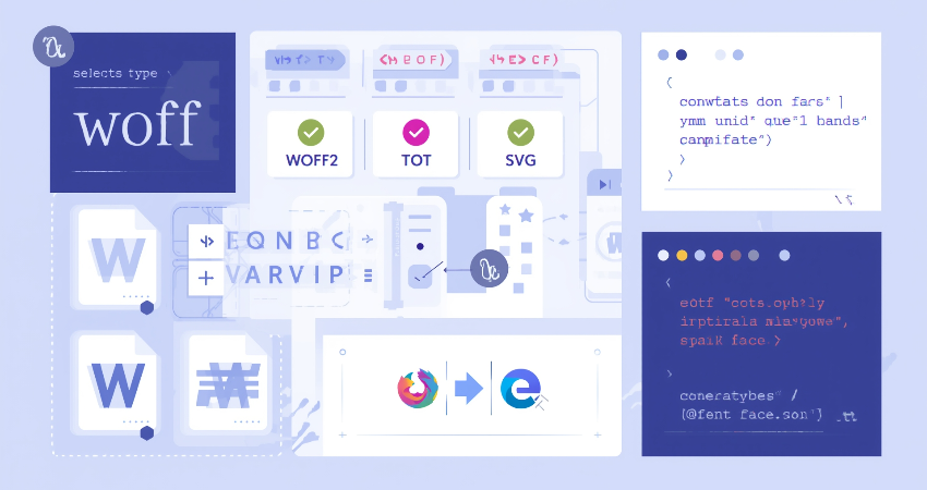
Understanding WOFF, WOFF2, TTF, and EOT
It is hence very important to have the right format for appropriate font selection in terms of cross-compatibility and maximum performance. WOFF, WOFF2, TTF, SVG, and EOT are common web font types. WOFF includes the advantage of being both wide in using and compressed as to decreasing file size that it has become the most widely-used format in most projects. WOFF2 goes one step further in compression and speed but lacks support for certain older browsers like Internet Explorer.
TTF (TrueType Font) and OTF (OpenType Font) standards are only used by desktop environments as their main applications, but they still find their way into the modern browsers. EOT, or Embedded OpenType, is another type of font, but primarily for compatibility with really old versions of Internet Explorer, which have now become obsolete. Using WOFF and WOFF2 covers most modern use cases, but it would still be possible to use fallbacks such as TTF or EOT for legacy cases. By offering multiple formats, you ensure that fonts will be rendered as consistently as possible regardless of platform and browser.
Using Font Subsetting to Reduce File Size
In the process of font subsetting, characters for that particular need are kept within the font file which can drastically bring down the file size and speed up loading times. If a website is only in English, why should it have all those characters as Latin, Cyrillic, Greek and Asian? Even though many font services such as Google Fonts offer subsetting features, adding the option of language selection, it is also possible to create subsets using tools like Font Squirrel or Glyphhanger.
Reduce your font files into those that carry only the needed glyphs, which ultimately results in smaller HTTP request sizes and thereby reduces first paint times. This works well with large families of fonts especially on multilingual sites where fonts can be isolated according to languages, creating room for conditional loading. Your site’s performance and better control on site appearance and resource loading will therefore yield results.
Techniques for Efficient Font Loading
Using Preload for Early Font Fetching
One effective method of speeding up font loading is by using the preload directive in your HTML <head>. When you preload fonts, you tell the browser to load the font as an early priority resource early in the page load up. This reduces the chance of FOIT and helps text render faster, especially on initial view of the page. The syntax looks something like this:
html
Copy
Edit
<link rel=”preload” href=”/fonts/your-font.woff2″ as=”font” type=”font/woff2″ crossorigin=”anonymous”>
Just preload fonts that are actually going to be used on your pages, since doing so will waste bandwidth. Even so, preloaded web fonts should match what has been defined in the stylesheets. Do not preload a ton of fonts; rather just the essential most highly used ones in headers or hero sections. Too much overloading can block the loading queue and thus affect performance.
Applying the font-display Property to Control Rendering
The font-display property has also been a blast in CSS when it comes to figuring out when and how to fire the rendering of fonts. The choices here are basically auto, block, swap, fallback, and optional. font-display: swap is a common recommendation because it enables the fallback fonts to be displayed straight away, with the custom font downloading in the background, which gets switched back once it is available; that means never re-blocking content.
font-display: swap offers a solution to FOIT – content is made visible much sooner, delivering a real boost in perceived performance. However, font-display: optional takes this even further in chasing speed, letting the browser simply not load the font at all if it’s going to take too long or isn’t deemed necessary. This is especially useful with secondary fonts in low-bandwidth scenarios. Careful configuration of font-display provides for much finer-grained control over user experience and loading behavior across browsers.
Hosting Strategies: CDN vs Self-Hosting
Advantages and Disadvantages of Hosting Fonts via CDN
Here are some points worth noting in serving fonts using a content delivery network (CDN): worldwide availability, reduced latency, and management ease. Automatic provision of the correct font format according to user browser and device will also be tied to services like Google Fonts and Adobe Fonts, which equally use browser cache and server distribution for speedier delivery.
On the downside, using third-party cdns generally means you will have their uptime, privacy, and performance quirks hanging over your heads. For example, imagine an unreachable CDN for a short time; your fonts are unavailable. Furthermore, the third-party CDN can hang some unnecessary tracking scripts, and that can prove problematic in places with strict regulations, such as in GDPR. Quite convenient, but giving way control-wise in terms of how fonts get loaded and cached.
Pros and Cons of Self-Hosting Fonts on Your Server
Self-hosting fonts means directly uploading font files to your server and referencing them in the CSS using @font-face. This gives full control over caching policies, subsetting, and loading behavior. Self-hosting is also relatively privacy-friendly because it does not involve third-party servers and works better for preloading and custom performance strategies.
With self-hosting, you also need to serve different font formats and take care of caching headers and CORS settings. One wrong configuration can block the font files, and one wrong design can make self-hosting more expensive in loading time and page size. But under these conditions, self-hosting often becomes the preferred solution for performance-conscious developers seeking for more control.
Ensuring Cross-Browser and Device Compatibility

Testing Font Loading Across Browsers and Devices
How the font-loading mechanism is fine-tuned may be of little importance if the results of practical tests do not show consistency across browsers since no two different rendering engines and/or font-handling rules will render the same optimized font in the same way across different browsers. Hence, manual testing should be performed on top of automated ones, including BrowserStack, LambdaTest, etc., or an actual device lab should be used to check how the fonts look across desktop and mobile versions of Chrome, Safari, Firefox, and Edge.
Test alongside to appearance performance metrics like First Contentful Paint (FCP) and Cumulative Layout Shift (CLS). Monitor alarming flashes of fallback font, shifting spacing, or late arriving fonts. This testing helps identify problems that are commonly overlooked and allows one to better fine-tune their strategies of loading in the real-world scenario rather than depending entirely on theory or assumptions.
Handling Fallback Fonts Gracefully
Fallback fonts are a crucial part of font loading strategies, serving as the backup mechanism when custom fonts fail to load. By defining a font stack in CSS—font-family: ‘CustomFont’, Arial, sans-serif—you let the browser take the next available font if the preferred one is not available. This way, content is guaranteed to remain legible and styled, even in failure cases.
Choosing fallback fonts carefully should prevent them from causing these layout shifts in measurements (width and height); they should match with your custom fonts. By means of assistance tools such as Font Style Matcher, fallback and custom fonts are aligned visually so that they can appear consistent from a designer’s point of view. This goes further to ensure good performance and accessibility since content is, at no time, hidden or rendered unreadable due to the improper handling of standards.
Conclusion
The entire process of loading fonts cross-browser is an artsy science. Much has been discussed about picking the right formats and subsetting methods, preloading directives, and smart font-display strategies to enhance performance and consistency, and rightly so. Such improvements lead to enhanced user experience, reduced load time, and better rendering across systems; all of them are very important in the web ecosystem, where time is of the essence.
It is also important for them to be consistently testing and iterating by using an assortment of automation tools together with manual tools that can detect rendering and performance defects. Hosting decisions regarding CDN or something else will greatly influence loading speed and reliability. If the developers could control the delivery, styling, and fallback of the fonts, they would be able to build visually attractive, performance-optimized sites that work well on any device/browser without sacrificing speed or user happiness.