What Google’s PageSpeed Insights scores really mean can sometimes be beyond one’s comprehension, especially if entering website performance tools for the first time. It is more than chasing that perfect 100 score; it is about the experience of your visitors and what can be done to make the site better for them. In this article, we’ll really try to shed light on score interpretation alongside the main sections of the report and what these metrics mean for your site’s performance.
Whether you are a web developer, digital marketer, or small business trying to improve website performance, somehow correctly interpreting the PageSpeed scores will turn the scores to your advantage for speed, SEO, conversion, and user satisfaction.
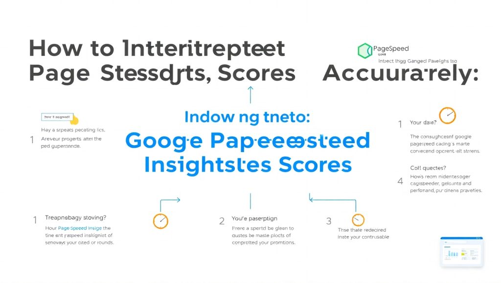
Let’s dive deep on how Google PageSpeed Insights work and what those colors and scores mean and, more importantly, what you can do with the information.
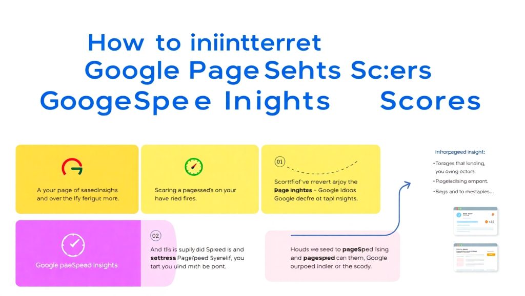
What Google PageSpeed Insights Actually Measures
Google PageSpeed Insights (PSI) doesn’t just analyze how fast your site loads—it goes much deeper. The tool evaluates both mobile and desktop versions of your site and assigns them a performance score based on various real-world and lab data metrics.
The score ranges from 0 to 100 and is color-coded:
- 90–100 (Green): Good performance
- 50–89 (Orange): Needs improvement
- 0–49 (Red): Poor performance
But don’t get too caught up in chasing that green score. It’s more helpful to understand what PSI is really measuring. The tool uses Lighthouse, an open-source auditing tool, and gives you metrics based on two types of data:
- Field Data (Real-world) – This is data from actual users who visited your site (if available).
- Lab Data (Simulated) – This is based on a controlled test environment to simulate how your page would load for a typical user.
Metrics like FCP, or First Contentful Paint; LCP, or Largest Contentful Paint; Cumulative Layout Shift (CLS); and Time to Interactive (TTI) heavily affect your score. Getting to grips with these will help you know what is working and what is not.
Field Data vs. Lab Data: What’s the Difference?
Field Data provides performance information from real users who visited your site using the Chrome browser. It reflects real-world variables like device type, internet speed, and geographic location.
On the other hand, Lab Data is generated in a controlled testing environment. It simulates how your website loads using a specific device and connection, making it ideal for debugging and spotting performance issues before they affect users.
Here’s why the difference matters: you might see a great lab score but poor field performance, especially if users in slower networks or on older devices access your site frequently. So, you need to evaluate both types of data before making any site changes.
Understanding this distinction is also essential when you use tools like Core Web Vitals optimization services to improve your results. It helps you prioritize changes that actually affect your users’ real experience.
How to Read the Performance Score Properly
Seeing a low score on Google PageSpeed Insights can feel alarming, but it’s important to stay calm and read the full report. The performance score is just a summary. What’s more important is the detailed breakdown of metrics.
Here’s how to interpret what you’re seeing:
- First Contentful Paint (FCP): Measures how long it takes for the first piece of content to appear.
- Largest Contentful Paint (LCP): Indicates when the largest element is visible—often a hero image or heading.
- Cumulative Layout Shift (CLS): Reflects how stable your page is while it loads. Layout shifts annoy users.
- Total Blocking Time (TBT) and Time to Interactive (TTI): Show how long it takes before the site becomes usable.
Use this breakdown to identify what’s slowing your site down. A low LCP or high CLS can drag your score down significantly even if your site feels fast.
It’s worth noting that some changes, like optimizing fonts or lazy loading images, can drastically improve these metrics without a full redesign.
What Do the Color Indicators Mean?
Google uses a color-coded system to make interpreting performance easy:
- Green (90–100): Your site is fast and healthy. Still, keep an eye out for future changes.
- Orange (50–89): You’re almost there, but something is slowing your load time—perhaps unoptimized images or third-party scripts.
- Red (0–49): This indicates poor performance. Prioritize fixes immediately.
Use these colors to determine task priority. Red doesn’t mean you will never fix it. With an almost-red CLV, the addition of a plugin or an image could silently push the value back up again. Always watch it, especially after updates or any design changes have been introduced.
Keep in mind that desktop scores and mobile scores may differ very much. Usually, mobile scores are lower because of weaker hardware and slower networks, which makes responsive web design all the more vital.
How to Use the Opportunities and Diagnostics Sections
Below your score, PageSpeed Insights gives actionable tips under “Opportunities” and “Diagnostics.” These are often the most valuable parts of the report, offering real fixes.
- Opportunities show you specific suggestions for improvement—like “Eliminate render-blocking resources” or “Defer offscreen images.” Each one includes an estimated saving in seconds.
- Diagnostics provides more in-depth technical details like JavaScript execution time or unused CSS.
This part is a goldmine for any developers or web designers. If you aren’t tech-y, you can just hand this to your web team or hosting company. Sometimes a fix might be as simple as enabling compression or setting caching plugins.
Also, if you’re running the show yourself, WP Rocket or Cloudflare can help patch up a lot of these problems without much advanced coding knowledge. In fact, many website owners hire a professional WordPress website design service to have these things optimized at the outset.
Common Issues and What They Mean
Some of the most frequent issues flagged by PageSpeed Insights include:
- Render-blocking resources: Scripts or styles that delay your site’s content from displaying.
- Unminified JavaScript and CSS: Files that are unnecessarily large due to whitespace and comments.
- Large image files: Images that haven’t been compressed or are too large for the display size.
Simple fixes often do wonders for load speed and user experience. For instance, by using next-gen image formats such as WebP, file sizes can be reduced by 30–40%.
Understand what each issue means so that you are not wasting time fixing things that do not matter. Go after the primary savings first and test the site after every fix.
When Should You Take Action?
Not every low score requires immediate panic. Focus on the context:
- Is your CLS in the red? Prioritize fixing shifting elements.
- Is your LCP above 2.5s? Optimize images and hosting.
- Is your mobile score worse than desktop? Your responsive layout may need improvement.
If your website design audit already showed issues, PageSpeed Insights can validate or highlight new ones. Consider making changes when:
- You see consistent slowdowns across multiple reports.
- Your bounce rate is high due to slow load times.
- You’re planning a redesign or new feature release.
If you’re unsure where to begin, consider hiring a developer or using a website speed optimization service that focuses on your specific needs.
How Often Should You Check Your Scores?
Website performance isn’t static. You should check your PageSpeed scores:
- After making major design changes
- When adding new plugins or scripts
- Monthly, to ensure continued performance
Changes in browser behavior, user devices, or Google’s algorithm can impact your score even if you haven’t changed anything on your end. A good rule of thumb is to audit your site at least once a month.
Also, don’t rely on PageSpeed alone. Use other tools like GTmetrix or WebPageTest for broader insight.
Conclusion
Google PageSpeed Insights is an extremely good tool; however, it is only as useful as you are in correctly interpreting it. Do not stress about scoring a perfect 100. Instead, focus on bettering the actual experience that your visitors have. Have clarity about what each metric means, its bearing on user interactions, and what actions will lead to notable improvements.
Keep in mind both mobile and desktop performances, and more significantly, site speed plays a prominent role in user retention, SEO, and conversions. Check the “Opportunities” section, then take on patches that will rank highest, and work towards retesting after each update. It does not matter if you’re managing your own site or working alongside a developer; getting your head around these scores is a stepping stone toward making a quicker, more meaningful web presence.